NASA's striking visuals reveals impact of greenhouse gases on oceans | Watch Now


PTC News Desk: The National Aeronautics and Space Administration (NASA) posted a visualization showing the effects of greenhouse gases on Earth's water bodies along with the statement, "Our ocean is changing." According to the space agency, the ocean is changing due to the chemicals created by human activity.
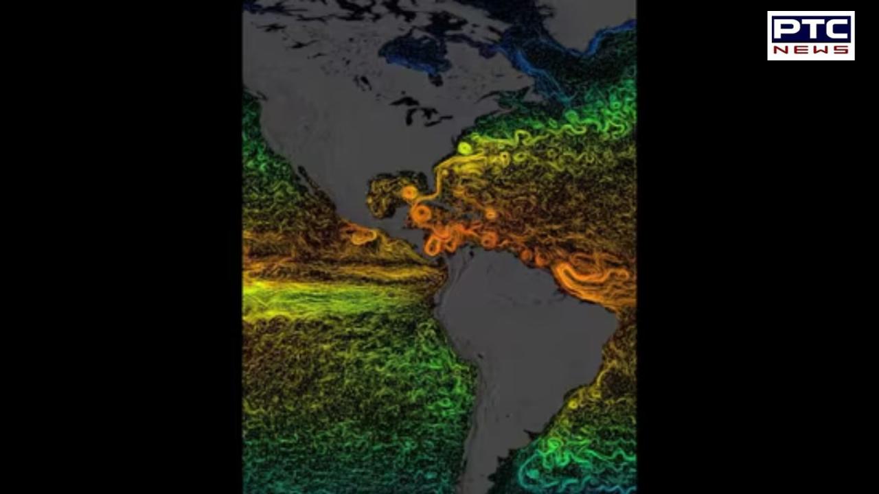
NASA provided an explanation of the visualisation, stating that the various colors represent the average temperature of the sea surface currents. According to the organization, "Warmer colors—red, orange, and yellow—represent warmer temperatures, while cooler colors—green and blue—represent lower temperatures."
Given that the oceans encircle 70% of the earth, they play a significant role in regulating the planet's climate. Nonetheless, we are witnessing the ocean's transformation due to rising greenhouse gas emissions from human activity. NASA added, "We're on a quest to learn more with our partners.
The video has gotten more than 8.2 lakh views since it was shared. Furthermore, the video has received about 8,000 likes. As they responded to the share, people left a variety of responses.
Also Read: BJP and Trinamool clash over Britannia's decision to close historic Kolkata factory
What did users of Instagram post regarding this troubling video?
Amazing data and visualisation, said an Instagram user. Really awesome! One person added, "Climate change is a huge problem," to the conversation.
"Could you please explain what this data is showing?" asked a post. Do the days or months pass? When is the year? Which is it—ocean temperatures or currents? What conclusions have we drawn from this data? "The visualisation shows sea surface current flows," NASA retorted. The related sea surface temperature data colors the flows. This specific visualization covers the years 2007–2008.
"I could gaze at this indefinitely," penned another social media user.
What do you think of this NASA visualization that illustrates how greenhouse gasses affect the oceans?
Also Read: NEET Row: CBI seizes burnt question papers, phones, and laptops from Bihar police | Know more
- With inputs from agencies