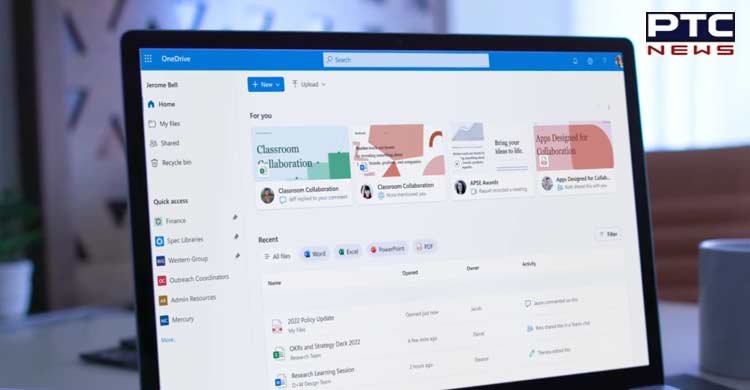
Washington [US], August 10: An American tech giant Microsoft is celebrating One Drive’s 15th anniversary redesigning its new home page called OneDrive Home and introducing new features, design and template.
 As per the sources, One Drive is introducing with its new features, designs and home page. Instead of arriving on the My files tab when a user first opens OneDrive, they'll find themselves on the new Home page that resembles that dashboard in the online version of Office.
 Also Read: Aamir Khan visits Golden Temple ahead of his new release ‘Laal Singh Chaddha’
Similar to the Office web app, OneDrive Home contains a list of user files, organized by how recently they accessed them. Above the list are filters that let users sort their documents by Word, Excel, PowerPoint, and PDF file types.
As per the sources, new ‘Activity’ column is also introduced at the right side of the owner file that tells a user when someone leaves a comment, @mentions another user, or assigns them a task within a shared document.
 On the left side of the Home view, Microsoft's adding a new Quick access section, where users can find and pin their most frequently-accessed spaces.
As per the sources, Microsoft has said OneDrive Home will be available in "the coming months."
 Also Read: Zoonotic Langya virus hits China, 35 infected so far
From what it looks like, though, the new Home page could serve as a central hub that should help users stay organized while collaborating remotely, reported sources.
-PTC News with ANI inputs
